Skip to content
Check out my my museum reviews blog →
Linda Aksomitis
Search
Home
About
Articles
Books
Courses
FAQ
Tag:
ebooks
How to Plan a Novel Series Made Easy with AI: Setting
An Easy Trick to Know Whether to Ask KDP to Change Your Book Categories
How Do You Get Your Book into the Amazon Categories You Want?
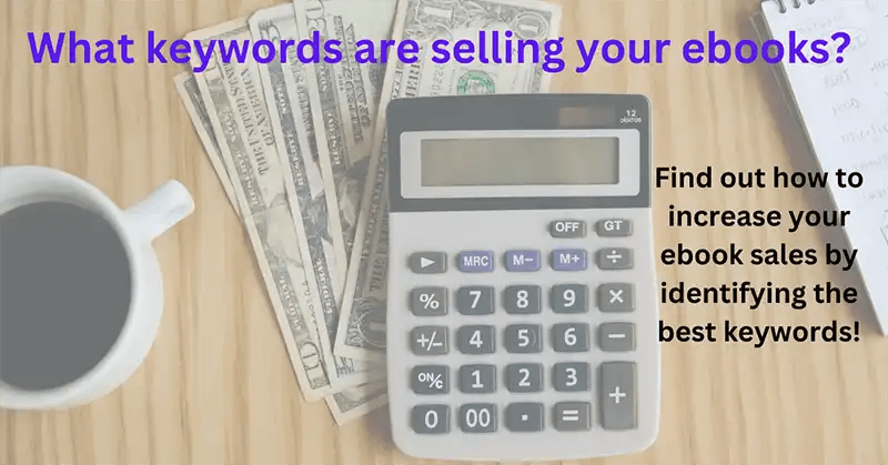
What Keywords are Selling Your Ebooks: A Step-by-Step Analysis
Public Domain & Copyright: Answers to Common Questions
Next Page
Subscribe
Subscribed
Linda Aksomitis
Sign me up
Already have a WordPress.com account?
Log in now.
Linda Aksomitis
Subscribe
Subscribed
Sign up
Log in
Report this content
View site in Reader
Manage subscriptions
Collapse this bar